Jewelry Mood Boards by Color are a powerful way to design, style, and shop jewelry with intention. By organizing pieces through color palettes—whether soft neutrals, bold jewel tones, or romantic blush hues—you create a clear visual direction that ties together materials like gold, silver, enamel, and gemstones. This approach not only enhances your jewelry aesthetic but also strengthens brand identity, improves jewelry styling ideas, and guides cohesive collections. From monochromatic jewelry mood boards to vibrant, maximalist color stories, understanding color theory jewelry design helps you craft pieces that resonate emotionally, photograph beautifully, and sell effectively.
The Power of Jewelry Mood Boards by Color
A jewelry mood board is more than a collage—it’s a visual language. It’s where color story jewelry, materials, textures, and emotion intersect to define a cohesive design direction.
When you begin exploring Jewelry Mood Boards by Color, something shifts. Instead of randomly selecting pieces, you start curating with purpose—pairing tones, refining contrasts, and shaping a complete jewelry aesthetic.
Think of it as the foundation of:
- Your jewelry design mood board
- Your jewelry branding mood board
- Your jewelry campaign aesthetic
And ultimately—your identity.
What Actually Goes Into a Jewelry Mood Board?
A well-crafted jewellery moodboard blends multiple visual elements into a unified concept. It’s not just about colors—it’s about how those colors interact with form, light, and material.
Core Components
- Color palettes (primary and accent tones)
- Materials (gold, silver, enamel, beads)
- Gemstone jewelry selections
- Product types (rings, necklaces, earrings, bracelets)
- Textures and finishes (matte, polished, brushed)
- Visual inspiration (editorial images, nature, fabrics)
For example, a warm-toned board might combine:
- Soft gold textures
- Blush gemstones
- Delicate chain details
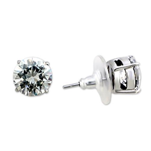
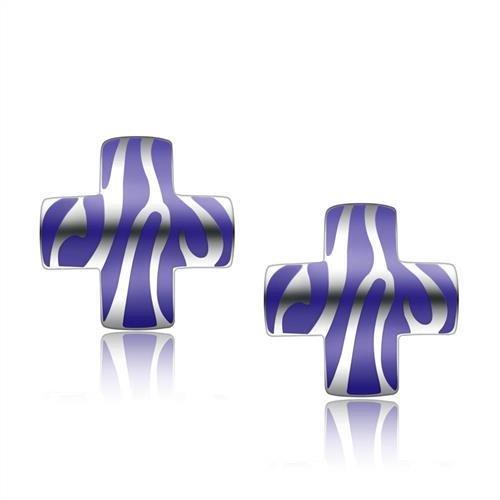
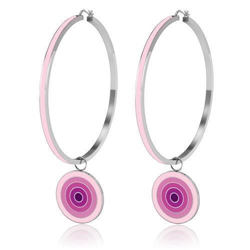
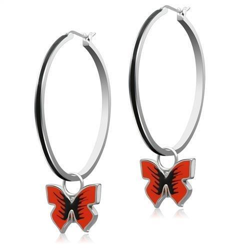
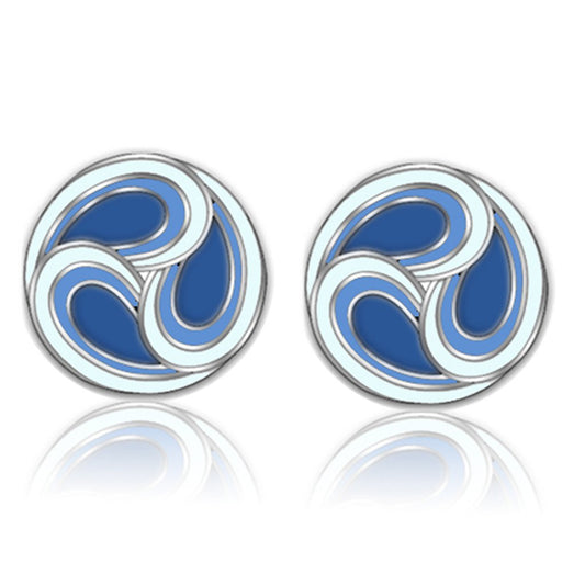
You might browse pieces like these from curated collections such as rings to begin building your palette foundation.
Why Color Is the Starting Point
Color isn’t just aesthetic—it’s psychological. It defines mood, perception, and even purchasing behavior.
This is where jewelry color psychology and emotional color jewelry come into play.
Color determines whether a piece feels bold or subtle, modern or vintage, luxurious or playful.
Color Drives:
- Mood-based jewelry styling
- Brand identity jewelry
- Storytelling through jewelry color
- Jewelry concept development
A blue jewelry mood board, for instance, immediately evokes calm, clarity, and ocean-inspired serenity—perfect for a cool tone jewelry styling approach.
Understanding Color Theory in Jewelry Design
To master Jewelry Mood Boards by Color, you need a working understanding of color theory jewelry design.
Key Color Strategies
1. Monochromatic Jewelry Mood Board
A single color explored in multiple shades and textures.
- Example: All gold tones
- Result: Clean, cohesive, luxurious
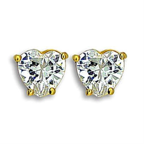
Perfect for building around timeless staples like necklaces.
2. Complementary Colors Jewelry
Opposites on the color wheel create contrast and energy.
- Blue + orange
- Green + red
This approach works beautifully in statement jewelry colors and bold campaign imagery.
3. Analogous / Tonal Jewelry Styling
Colors that sit next to each other on the spectrum.
- Pink → red → orange
- Blue → teal → green
This creates a seamless color palette inspiration jewelry look—ideal for soft transitions and romantic jewelry tones.
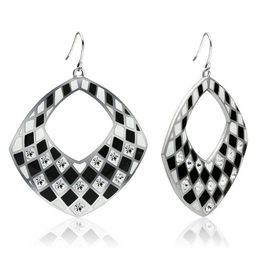
4. Contrasting Colors Jewelry
High-impact combinations that stand out immediately.
- Black + gold
- White + emerald
Often used in jewelry editorial shoots and jewelry campaign imagery to grab attention.
Building a Jewelry Mood Board by Color Palette
If you’ve ever wondered “how to create a jewelry mood board by color”, it starts with intention.
Step-by-Step Approach
-
Choose Your Core Color
- Example: Emerald green
- Defines your entire direction
-
Add Supporting Tones
- Metallics (gold/silver)
- Neutrals (beige, black, white)
-
Select Jewelry Pieces
- Earrings, rings, bracelets, necklaces
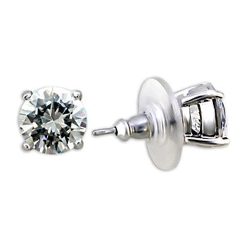
- Explore pieces like earrings to anchor the look
-
Incorporate Texture & Materials
- Smooth metal vs raw stone
- Polished vs matte finishes
-
Layer Visual Inspiration
- Fabric swatches
- Nature imagery
- Editorial photography
From Mood Board to Real Jewelry Styling
A jewelry inspiration board doesn’t just sit on a screen—it translates into real-world styling.
This is where jewelry styling ideas and jewelry flat lay styling come alive.
Imagine:
- A neutral jewelry palette styled for minimal elegance
- A vibrant jewelry palette built for summer campaigns
- A luxury gold jewelry palette designed for timeless appeal
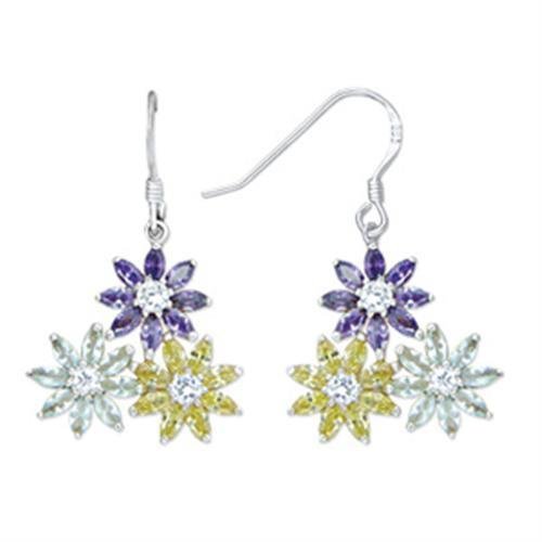
Even something as simple as stacking pieces from bracelets can reflect a complete color story.
The Rise of Color-Driven Jewelry Collections
Modern brands are no longer designing randomly—they’re building color-driven jewelry collections.
This means:
- Launching seasonal jewelry color palettes
- Creating curated jewelry color edits
- Encouraging customers to shop jewelry by color
It’s not just design—it’s strategy.
The strongest collections today are built like mood boards first—and products second.
Exploring Jewelry Mood Boards by Color: From Subtle to Statement
Now that the foundation is set, it’s time to move into the most visually compelling part of Jewelry Mood Boards by Color—the palettes themselves.
Each color tells a different story. Each combination creates a distinct jewelry aesthetic. And when applied correctly, each one becomes a powerful tool for branding with jewelry color palettes, styling, and even conversion.
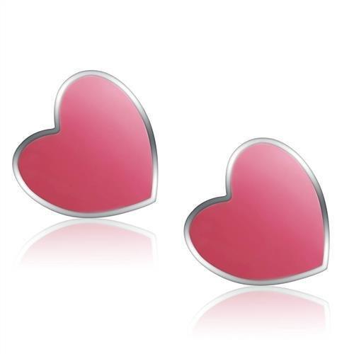
🔴 Red, Pink & Warm Tones: Romance, Energy, and Expression
A red gemstone jewelry mood board is bold, emotional, and impossible to ignore. It’s where passion meets luxury.
Key Characteristics:
- Ruby jewelry aesthetic and deep garnet tones
- Soft blush jewelry palette variations
- Warm metallics like rose gold and yellow gold
- Flowing, organic shapes
This palette thrives on romantic jewelry tones and is perfect for:
- Statement pieces
- Evening collections
- Gift-focused campaigns (especially for emotional occasions)
Think: candlelight reflections on polished gold, layered textures, and a sense of intimacy.
Styling Direction:
- Pair warm gemstones with delicate chains
- Use tonal jewelry styling for a soft gradient effect
- Mix materials like enamel and polished gold for contrast
This is where storytelling through jewelry color becomes deeply personal.
🔵 Blue & Cool Tones: Calm, Clarity, and Modern Elegance
A blue jewelry mood board leans into serenity and structure. It’s clean, refreshing, and incredibly versatile.
Core Elements:
- Sapphire jewelry palette and icy crystal tones
- Turquoise jewelry aesthetic for a more relaxed feel
- Silver and white gold materials
- Minimalist silhouettes
This palette is ideal for:
- Cool tone jewelry styling
- Ocean-inspired jewelry collections
- Modern, everyday wear
A well-built blue palette feels like still water—balanced, reflective, and quietly powerful.
Design Tips:
- Use monochromatic jewelry mood board techniques for sophistication
- Add subtle contrast with white or pale neutrals
- Focus on clean lines for a strong jewelry Instagram aesthetic
🟢 Green & Earthy Tones: Nature, Balance, and Organic Luxury
A green gemstone jewelry mood board brings grounding energy. It connects directly to nature and authenticity.
Signature Features:
- Emerald jewelry palette richness
- Mossy, olive, and forest tones
- Mixed textures (raw stones + polished metals)
- Organic, imperfect forms
This palette defines:
- Nature-inspired jewelry palette
- Earthy jewelry tones
- Sustainable, conscious branding
Green boards often feel curated yet effortless—like they were discovered rather than designed.
Styling Approach:
- Combine different shades of green for depth
- Use gold to warm up the palette
- Incorporate texture heavily in jewelry photography mood boards
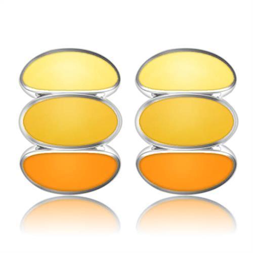
🟡 Gold & Yellow Tones: Warmth, Luxury, and Timeless Appeal
A gold jewelry mood board is perhaps the most universally appealing. It’s where tradition meets modern refinement.
Core Elements:
- Warm gold aesthetic jewelry
- Soft champagne and honey tones
- Metallic layering
- Light-reflective surfaces
This palette is central to:
- Luxury gold jewelry palettes
- High-end branding
- Classic, everyday elegance
Gold doesn’t just complement—it elevates everything around it.
Execution Ideas:
- Build a monochrome jewelry styling board using only gold tones
- Layer chains, cuffs, and textures for richness
- Highlight shine in jewelry product photography ideas
⚫ Neutral & Minimal Palettes: Precision, Simplicity, and Modern Design
A minimalist jewelry mood board strips everything back to essentials. It’s intentional, refined, and highly curated.
Palette Components:
- Black, white, beige, nude
- Soft metallic accents
- Clean, geometric shapes
This style defines:
- Neutral jewelry palette
- Black and white jewelry aesthetic
- Elevated simplicity
Minimal doesn’t mean empty—it means every element earns its place.
Styling Focus:
- Use negative space in your mood board collage
- Prioritize form and proportion
- Build cohesive looks using subtle variations
These boards are especially effective for jewelry branding visuals and modern campaigns.
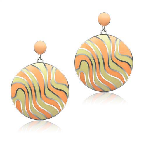
🌈 Multicolor & Bold Palettes: Energy, Play, and Maximalism
At the opposite end, the colorful jewelry mood board celebrates abundance. It’s expressive, dynamic, and unapologetically bold.
Key Features:
- Rainbow gemstone jewelry
- High saturation tones
- Mixed materials and finishes
- Layered, eclectic compositions
This approach fuels:
- Maximalist jewelry aesthetic
- Youthful, trend-forward collections
- Eye-catching jewelry campaign imagery
This is where rules loosen—and creativity takes over.
How to Balance It:
- Anchor with a neutral base
- Use repetition to create cohesion
- Build intentional chaos through color coordination jewelry
Creating Cohesion Across Color Stories
No matter which palette you choose, the real challenge is cohesion.
A successful jewelry mood board by color palette always answers:
- What is the emotional tone?
- What materials reinforce that tone?
- How do pieces interact visually?
Techniques to Unify Your Board:
- Repetition: Repeat colors or materials across pieces
- Hierarchy: Choose a dominant color and supporting tones
- Contrast Control: Use contrast intentionally, not randomly
- Balance: Distribute visual weight evenly
From Palette to Product: Making It Wearable
Designing a beautiful board is one thing—translating it into wearable jewelry is another.
This is where:
- Gemstone color combinations jewelry
- Color-driven jewelry collections
- Jewelry collection themes
…become actionable.
For example:
- A blue palette might translate into layered cool-toned pieces
- A gold palette becomes stackable, everyday essentials
- A multicolor palette transforms into statement sets